Project: Zettle Android SDK
Team: Android developer + Product designer
Background and approach
With the success of our existing iOS SDK in mind, we decided to expand our portfolio by developing an Android SDK as well. Our SDKs enable merchants using external point-of-sale systems to integrate and utilize Zettle card readers for fast and reliable card payments. The SDK consists of two main workflows:
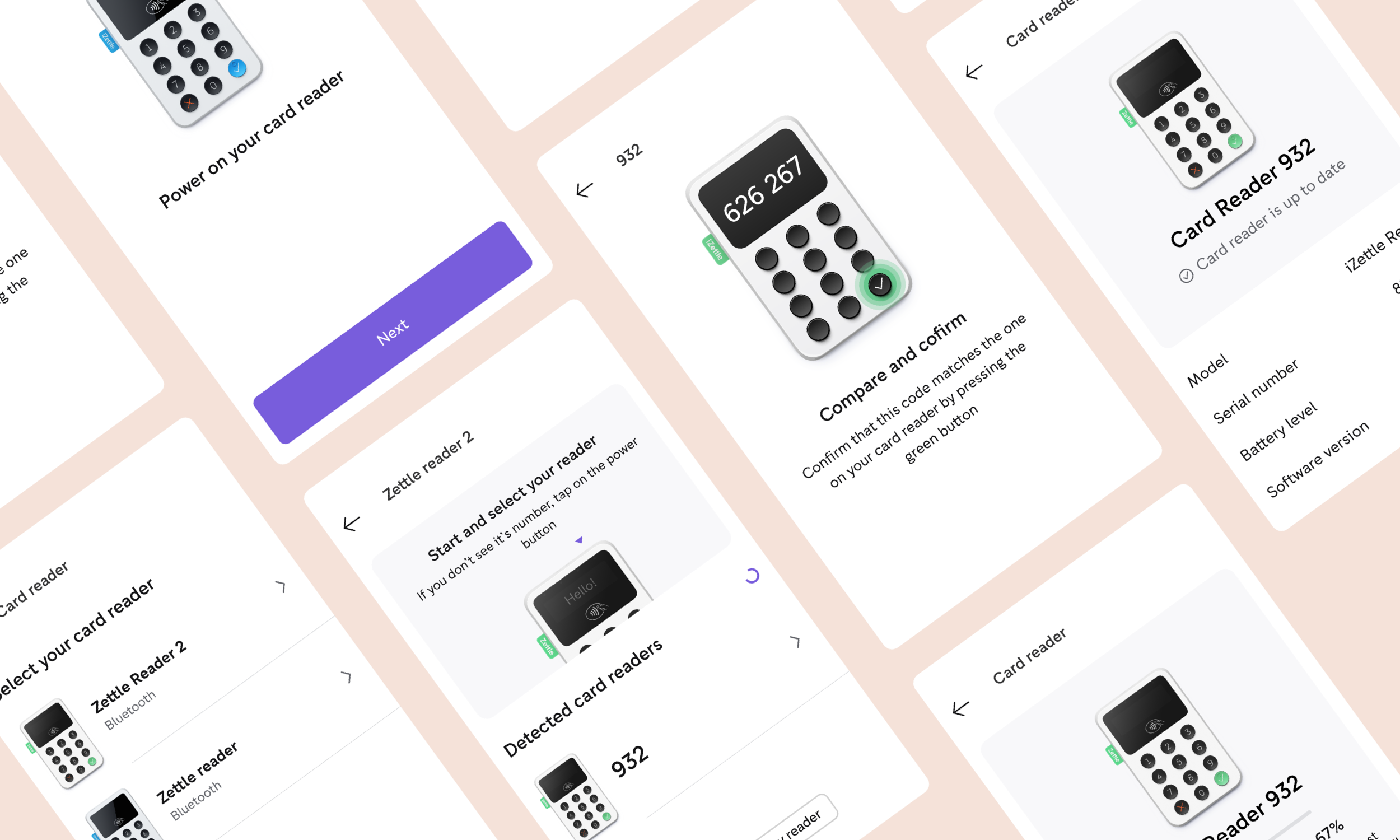
Pairing the card reader via Bluetooth.
Processing a card payment using the card reader.
This type of user represents a growing segment of our client base and constitutes a significant portion of our revenue.
Initially, the Product team proposed a one-to-one implementation based on our existing Android Go app. However, the Design team did not fully agree with this approach, as our Android app at the time had suffered from years of being deprioritized and was therefore in poor condition. Additionally, two new and exciting hardware and payments projects were in the pipeline, both of which would be based on Android, further strengthening the case for an improved implementation. To us, it was evident that we should seize this opportunity to revitalize our Android platform.
To make this vision tangible for all stakeholders, we outlined what could be achieved without requiring excessive design resources and how we could move forward quickly with a small autonomous team. We aimed to define improvements that could be implemented without creating dependencies or triggering extensive discussions across teams. We identified "low-hanging fruit"—primarily visual enhancements that would require minimal effort yet deliver a significant impact. These improvements are presented below.
Breakpoints
Essentially, it’s a matter of decision. By defining a breakpoint between phone and tablet devices, we were able to enhance the user experience, particularly on tablets. This approach allowed us to take advantage of modals, which proved beneficial in our specific context.
Modals made perfect sense when considering how our "external" pairing and payment flows would function. Imagine a scenario where a merchant, using virtually any POS system, triggers our external payment flow by pressing a charge button—opening it within a modal. We believed that using a modal would reinforce the idea of a service within a service, visually floating above the POS system while keeping it as a contextual background.

Responsive template
Designing for Android means designing for a large variety of screen sizes and ratios. How do you avoid things from breaking on small screens, but at the same time make sure you benefit from the generous real estate on big ones? This was probably the thing we spent the most time thinking on. We also wanted to define a template with guides to re-use as much as we could. This wouldn’t just save us time but force us to follow a consistent layout. Using a template with guides would also enable us to animate items to different known positions in a quite uncomplicated way. To make this template responsive, we decided to build the layout on a percentage-based anchor line. Since all guides were set to be dependent on the anchor line we could quite easily adjust the percentage value along the way to find out what worked out best looking at various screen sizes.

Polishing components
Since one of the objectives of this SDK was to replace the existing card payment flow in our own Android POS app, we needed to ensure coherence with both the existing context and design while also striving to advance the visual experience.
With this project, we also aimed to raise awareness within our in-house Design System Team about the importance of prioritizing Android development. Rather than implementing radical changes, we focused on refining and enhancing existing elements. Additionally, we involved designers from multiple teams in frequent design reviews, which proved to be an effective forum for driving change.
While the Zettle Android POS app is not yet flawless, it has been prioritized and is well on its way to becoming a solid and reliable product.

Polishing content
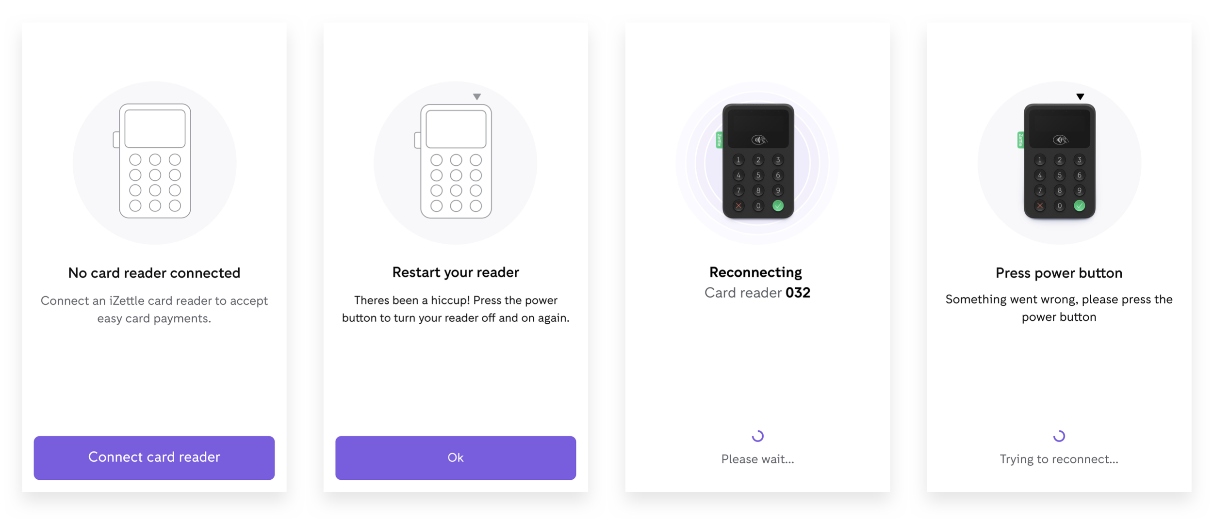
One of the most cost-effective and straightforward ways to create a significant visual impact in an application is by paying careful attention to its visual content. We focused on redrawing, refining, and maintaining a consistent style for the illustrations to enhance clarity and coherence.
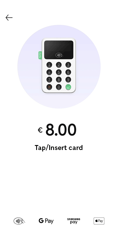
Both the pairing flow and the card payment flow rely heavily on being perceived as seamless and efficient. Therefore, our primary objective in designing the visual elements was to reinforce a sense of simplicity and ease of use.


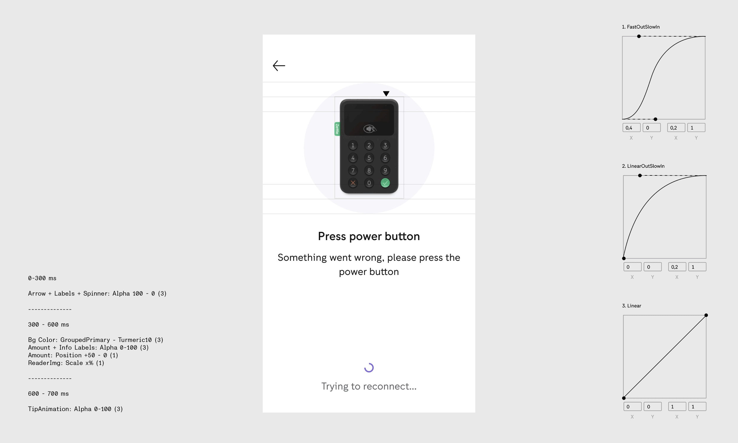
Motion
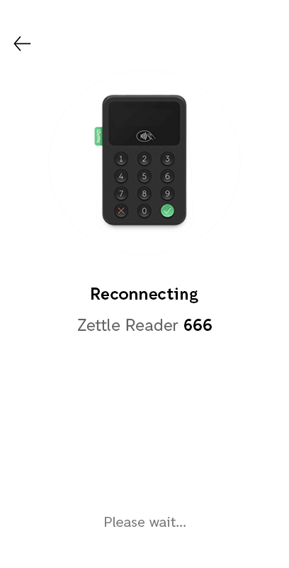
The SDK continuously communicates with the physical card reader via Bluetooth. Since this interaction happens behind the scenes, it can sometimes be difficult to grasp what is occurring and why. Additionally, in an over-the-counter sales scenario, the two screens face different directions and serve two distinct users—the merchant and the buyer—who may be dependent on each other’s actions.
To highlight such situations and states, and to effectively capture user attention, we incorporated motion. To prevent the frequently repeated card reader image from becoming intrusive or monotonous, we animated it as a shared element across instant transitions. This approach was designed to create the impression that it is the same reader—your reader—remaining with you throughout the process.
To further enhance personalization, we ensured that the UI reflects the actual color of the connected card reader. If a black reader is paired, the UI displays a black reader; if a white reader is connected, the UI adjusts accordingly, reinforcing a sense of familiarity and ownership.
Creating animations for Android is relatively straightforward for designers, as they can be designed in After Effects and exported as XML using Bodymovin, allowing developers to easily integrate them. However, transitions and shared elements are more complex to implement.
To ensure accuracy in execution, I prototyped all animations in Principle and meticulously documented timing values and interpolation details. Additionally, I provided a slow-motion video as a reference, enabling developers to implement the animations with precision.